Discover
Fresh ideas from your catalog
More from the web


Fresh ideas from your catalog
More from the web
Journal
Essays on materials, light, moodboards, and how to read a space — illustrated with rooms from your catalog.

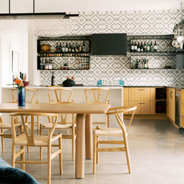
Skip the random pin dump. Use a tight palette, one hero material, and three supporting textures so your kitchen reads as intentional — then test every save against that thesis.

Bathrooms feel expensive when surfaces absorb light instead of competing with it. Build a soft field, one honest stone moment, and metal that behaves like punctuation.

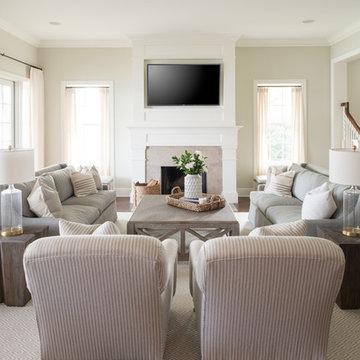
Depth comes from tone, textile, and silhouette — not from filling every corner. Build layers the way a stylist edits a shot: rug, seating height, light pool, one vertical gesture.

Scale, storage, and soft contrast do more for a compact bedroom than another piece of furniture. Keep the bed the largest quiet shape and reclaim the floor.

Treat the patio like an interior: define a floor, invent a ceiling of shade, and give people a reason to sit longer than five minutes.

Before you shop, learn to see proportion, light direction, and the one idea holding a space together. Copy relationships, not SKUs.

A dining room is a stage for conversation. Light the faces, soften the perimeter, and give the table enough presence to feel ceremonial without becoming stiff.

Your foyer writes the first line of the house. Give arrivals a clear path, a place to put something down, and light that flatters rather than interrogates.

A working room needs a calm field of view, honest storage, and lighting that does not tire the eyes by 3 p.m. Make it feel permanent even if the desk is small.

Color gets a bad reputation when it arrives as scattered accents. Treat hue like a material — limited, repeated, and tied to light — and the house starts to hum.

Ceiling glare is cheap. Layered light — ambient, task, and accent — is what makes materials read and faces look alive after dusk.